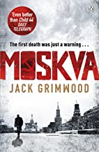
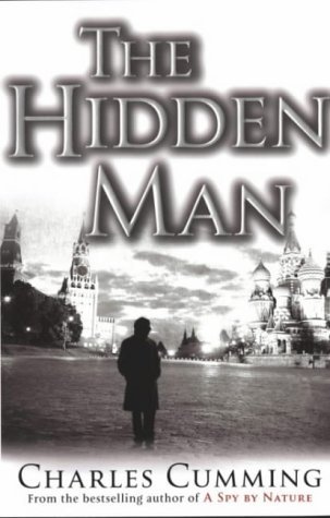
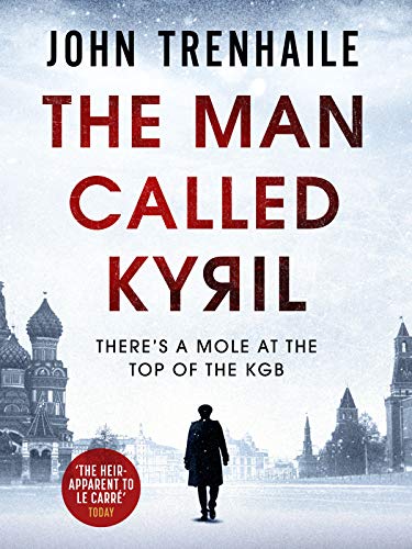
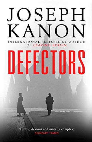
‘Cover for a thriller about Russia? No problem. If it’s a thriller, you’ll need a silhouette of someone. From behind is what most people choose. And Russia? Hmm … We’ll just put them on Red Square. That should do the job.’
But it wasn’t always like that. In the 1980s and into the 1990s, it was symbols, not silhouettes. Usually the hammer and sickle. Sometimes a red star.
Russia in Fiction might even have found the cover that sits on the boundary between symbols and silhouettes. Read on …
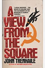
John Trenhaile’s A View from the Square (1983) illustrates well the different trends in Russia-in-fiction covers. On the left is a 1980s cover of this second novel in the excellent KGB General Povin trilogy. On the right, the cover of the re-issued e-book, due out this very week (release date 8th February 2021).

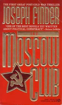
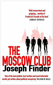
The same symbol to silhouette switch can be seen on Joseph Finder’s splendid novel The Moscow Club (1991).
Even when there is no Red Square involved, it is apparently still the law that new or re-issued Russia-related fiction must have a silhouette on the cover. Robert Harris’s Archangel (1998) had a Russian forest picture on the front of the version I first read (in one sitting, on a bus from Yorkshire to Cambridge). Later a silhouette of a man walked through the forest and onto the cover.
So desperate it seems was the need to demonstrate how the new ‘silhouette law’ had not been broken, that one was even hidden in the ‘g’ of Archangel, just to make sure.


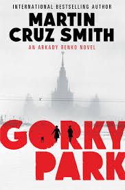
A similar ‘before and after’ exercise can be done with Martin Cruz Smith’s classic Gorky Park (1981). In fact, almost all of the re-issues of Smith’s Inspector Renko novels in the second decade of this century have silhouette covers. (See, for example, Tatiana).

It would be great to give credit to the earliest cover-designer who went for the ‘silhouette, Red Square’ approach. Because whoever it was, boy, imitation is a very frequent form of flattery …


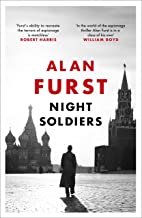


And the chosen dozen above is far from a comprehensive display of ‘silhouette, Red Square’ covers. Regular readers of this blog will note that this gallery misses out at least three other books reviewed here, James Steel’s December, Sally McGrane’s Moscow at Midnight, and Charles McCarry’s Old Boys. Not to mention many more Russia-in-fiction silhouette covers with no Red Square, for example, Jason Matthews’s Red Sparrow and Ben Creed’s City of Ghosts.
Russia in Fiction has been looking for the cover that marks the moment when symbols were on the way out and silhouettes on the way in.
The best we have come up with for now is Dennis Jones’s 1990 Gorbachev abduction novel Warsaw Concerto (published in the United States and elsewhere simply as Concerto). Symbol top right, silhouette bottom right.

Weirdly, the copy of Warsaw Concerto on my shelf has this same cover but without the silhouettes in the bottom right hand corner. (It is pictured in this post here). Ah-ah! It must be the missing link. I am already imagining the publishing police, black balaclavas on, raiding the offices of Futura, citing the new silhouette requirement, and demanding the appropriate adjustment.
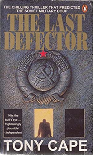
And to back up our theory that a transition from symbol to silhouette was happening on Russia-in-fiction book covers around the time of the Soviet collapse, check out the cover of Tony Cape’s The Last Defector (1991).
If you know of any symbol-to-silhouette example better than that, or have a favourite symbol / silhouette cover to share, then email Russiainfiction@russiainfiction.com