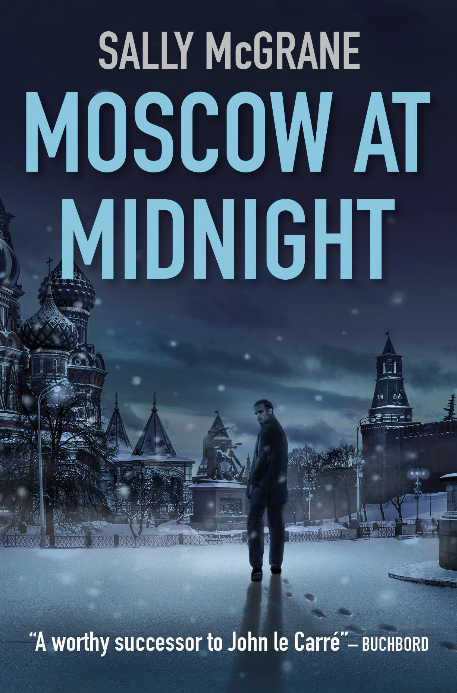
‘Cover for a thriller about Russia? No problem. If it’s a thriller, you’ll need a silhouette of someone. From behind is what most people choose. And Russia? Hmm … We’ll just put them on Red Square. That should do the job.’
But it wasn’t always like that. In the 1980s and into the 1990s, it was symbols, not silhouettes. Usually the hammer and sickle. Sometimes a red star.
Russia in Fiction might even have found the cover that sits on the boundary between symbols and silhouettes. Read on …
Continue reading